Showing posts with label psychopathology. Show all posts

Monday, June 20, 2011

Scribbled ends, more work, thoughts


As usual, click for intended sizes.


The color work is getting faster and more streamlined. I'm working under very tight deadlines. Eventually I'll become fast enough that I will be able to experiment more with formalist aspects even within those strict timeframes. I am enjoying my work more, at least. Some pieces are more painterly, others are more comic arty in their method, a good balance to keep me interested and the results relatively fresh. Now on to the last (? see below) batch of Scribbles.

Self portrait. This is probably my pick from the lot and my second favorite self-portrait on the whole. There's a slight psychoanalytical comment in this on how I use complexity as obfuscation, and therefore, as a shield. It's a reminder to untangle myself. That such a potent (for me) piece occurred through scribbling means the experiment was generally successful.


This is about details. Where the neck meets the jaw.

This is just cyberpunk faux-machinery stress relief inking. The last one I've made and the one that made me feel as if I'm done with Scribbler for now.

This isn't very good, but included for the soft approach. The program's not too suited for this.

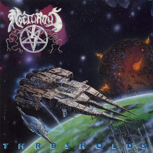
This one was fun to do. It says "Thresholds" at the top. It's a re-imagining of a Heavy Metal album cover by the band Nocturnus, done from memory. I checked later to see how close it was. Not at all. This is also one of the rare pieces that I did where I started from a black base, hence the kind of chalky highlights and so on. Neat.

This is Roger Dean-esque stress relief. Enjoyable for me and a continuation from Scribbler_12b.png. Perhaps the ink hatching was a bit too harsh for the intended effect.

This is joyfully (or perhaps, morosely) subtitled "I am on the internet!". This little bird character has this wonderful landscape vantage from his treehouse and yet he browses.

The finality of the above theme. Trapped.

Scribbler helped in a very direct way with getting me back into drawing for pleasure. After ZX I've grown accustomed and perhaps dependent on 'perfect inking'. Great DPI, greater zoom strength, curve correction and other such OCD processes that make my inking perhaps a bit sterile. Once I got the critique "Helm, now that you ink digitally your stuff is worse" to which I replied "this is how I always wanted to ink so uh, bad luck for us both I guess". My aspiration for 'perfect lines' will never be satiated.

However this is akin to writing a book and never going on page two until the syntax and grammar (not to say the notions and thoughts) are absolutely as perfect as they can be. This is how I made ZX (more or less, nothing perfect there, but surely a struggle towards this direction) and I believe someone can write such a book if it a very important book to write, for their psychological well being.

However for faster, simpler, stress-relief work, this obsession with perfection is counter-intuitive. Scribbler helped in that it has no zoom and its mechanic for rendering is just a tad unpredictable. There has been a reconciliation with roughness in ink through it. I wonder if it'll impact my high-purpose work as well. I don't really know if I'm done with Scribbler completely, but I know that I'm done with using it every day for a while, at least. It's been therapeutic, but there's further steps to take now. I'm in the middle of moving out, life is happening!

Read more...

Tuesday, November 4, 2008

Next Drink


Hello. A word by Richard Green:


I have been requested to write on this comic. In doing so I hope that Helm will return my puppy, or at least most of it.

This is probably a great way to avoid when designing a comic. I sat down with a piece of paper. I divided it into a grid.

I drew a man drinking. He walked away. In the midst of his journey I got bored and made him climb a building.

He reached his destination, something I decided on whilst drawing him climbing up the building.


By accident, symmetry. Spontaneous order had emerged.


I enjoy the fact that the comic is mirrored. In the first and sixth lines, we see this man in his primary world. He sits and drinks. He is not surly, self pitying or even drunk. He lives a blameless if meaningless existence.

But he can leave and enter that as he pleases. In the second and fifth lines he does so.

And in the middle he breaks from that world into something more. Just for a moment he entertains a diversion before returning to the task at hand.


I'll also write a little on the art Helm has built over my rather Spartan drawings.

I did not envisage him living in a squalid urban hellhole. The whilst drawing the first two lines I imagined him drinking in a suburban licensed club. The establishments of choice for blameless substance abuse (and garden variety gambling problems). It was only outside that there was a need for an external environment made of straight (and easily drawn) lines. He entered a concrete jungle.

And of course Spider-Man doesn't climb the sides of bungalows.

Because, as I envisaged it, he was climbing like Spider-Man.

Spider-Man is everyman, with powers, and so is this man. He is Spider-Man in middle age, Chris Ware's Spider-Man. He exists betwixt lost dreams and despair.

This is not to be depressing. It isn't depressing. The everyman is not an indulgent Byronic hero, intent on theatrical tragedy.

He endures, in some form.

And existence is the purpose.


And a few words from me, your tyrant:

Animation is not like comics at all. Often you'll find people who like comics also like animated films. I don't, particularly. I think that impulse comes from when we were children and you could show us any sort of drawn anything and we'd shit our pants. I find animation is in love with setting things to motion and how that motion is conveyed whereas comic art is in love with perfect sequences of events as portrayed in concert, on an inclusive context. I understand these are pretty dry distinctions but if you were to sit down with a comic artist and an animator and discuss with them why they went their separate ways through life, in the end the picture could be summed up as such. Personally I find myself quickly bored with something that is bouncing around on my screen and though as a child I did watch my share of cartoons I suspect I was bored of most of them even then. I'd much rather spend time looking at a single page of comics for a hour than watch an episode of Tom and Jerry. Don't judge me, that's just how I am! For me there is something really brilliant and beautiful in a well-done comic page. It's a finite number of viewpoints into a finite number of situations and effects but 'between the gaps' there is the promise of a whole, timeless and perfect world. Any medium where the tyranny of linear time dictates pace and direction somewhat loses that, for me.

So why am I saying these things? Because the comic at hand 'A Story by Richard Green' is very much made to appear like a short animated film. It is even made in a similar way. Static backgrounds were drawn (6 of them), then a character with little shading and simple forms, easy to animate, was superimposed on a different layer on top of these backgrounds, moving. Not talking or thinking but mainly moving from a place to a different place.

Why did I make a comic that looks like an animated film since I don't really care for them? Because I wanted to harness that boredom I felt when waiting for something to happen while some cartoon hero was squishing and deforming and whatever else. I wanted a pretty tortuous pace. As a comic, this whole page could be summed up in three panels (first and last being first and last and the middle panel him climbing a building, as a matter of fact). The whole middle time is watching and waiting. From one drink to another, the diversion of the spider-man climb signifying the mundane realism of any means to such an end. That was the feeling I got from Richard's original draft comic and I tried to serve it as best I could. I wasn't going for depression as a theme so much as for some sort of existential tiredness, punctuated by a sharp digression.

Oh, also, of interest is that this comic is not taking place in Athens like most of my comics (even if not mentioned so, at least conceptually). It's taking place somewhere in Australia because that's where Dick is from. I didn't do this on purpose, I just realized.

-Helm

Read more...

Wednesday, October 22, 2008

Anger Management

Man, this comic. It's a bit overwrought and I feel the way I drew the dude's face is quite bad, but I like the idea and the format. Upside-down speech is a good visual cue for subconscious thought patterns. I also like how the line-work in the top and bottom row is delicate and thin and the violence panel is made with a big brush that chops up the space harshly between space and object. If only I had structured that face traditionally a bit better. You can't improvise everything.

This idea came to me when I was visiting Brussels with my dad. I was very sad at the time, to the point where I couldn't sleep at night, and I paced and paced the hotel room (again a hotel room), I did endless series of push-ups to tire myself out and I broke the washroom's basin by mistake. Actually the worst of all of that is when you lie in bed trying to sleep with one ear on the mattress and you play rhythmic patterns with your fingers and hear them reverberate through the mattress, booming at the empty silence.

So perhaps the ugliness suits it! I have rationalized a small win for me right there.

On the formal level: 1) same face on all panels, slightly worked over to avoid cut-and-paste effect, but effective emotionally. Stonewall face. 2) throat gurgling sound effect: it works. Don't always put actual letters in sound panels, it's very useful to upset the reader expectation sometimes. 3) I went with the throat punch for extra cruelty. Of course nobody aims there on purpose but man if it happens it's much worse than a face hit. 4) Story starts 'after the fact'. The reader is encouraged to fill in the blanks. The 'plot' doesn't matter here, what matters is the human situation. When you just have a single page's worth of space you need to cut the most inessential corners and retain the gist of it. This was good practise for me regardless of how many pages a next comic I do will be.

Also, I wanted to say: thank you if you forwarded the comic to any interested friends. I really appreciate it. Don't hesitate to drop me comments, though, I see lately they've been sparser. That's fine, I understand there isn't an infinite amount of things to be said about what turns out to be a pretty homogeneous body of work but still, any communication is welcome.

- Helm

Read more...

Tuesday, October 7, 2008

Deep Inside the Earth


I'll start with the customary "how did this ever see print in a large newspaper without a long history and audience in comics?!" Now that the interrobang is out of the way, this is a comic made under peculiar circumstances. To not go too far into it, at the time my sense of priorities was somewhat unreal, I wasn't seeing the meaning in a lot of things, generally perspective was skewed. I took my time with it and I made certain it worked like I wanted it to work. It breaks various narrative rules to the point where it might be a bit unreadable as a comic, but at the time I didn't care about that. There is a case to be made about interesting art being created when the artist has a disregard for common wisdom about how his art form of choice works, but that goes only as far as you as a reader finds this particular comic to be interesting. Frankly I'd be surprised that people would see this and feel any impulse to read it.

There is a common concept in comics that if the words overpower the images, the reader skips text or skips page. The vice versa doesn't apply as such, but if a page has no text or very little text, most readers read it VERY FAST, which is a good communicational tool for the aware comic artist. Generally more than 30 words per panel (given a print size of about a4 or smaller and a regular typeface size) is a good limit, and if possible, that text should be broken up in favourable places in the panel, not infodumped on the top or whatever. This comic breaks this rule in a big way, ripping word from image at the seams, making this less a comic and more "prose with some pictures behind it". Or is it "pretty pictures with some inconsequential text on top"? In any case, I was aware of this and chose this particular harsh juxtaposition to serve this story when I made this in 2006. I do this a couple more times in the future in these series, with variable degrees of effect.

There were artistic concerns here. The whole page is mostly drawn with a pentel inkpen, I generally avoided my usual 0.1 marker scribbling. I didn't want the images to look packed with detail. In the visual arts there is a distinction between 'detail' and 'visual information'. The difference is that detail may carry information but it also may not, and just be there to pack up the image, to inspire awe to the viewer... the "oh wow, look how many little lines!" effect. I do this occasionally because awe is a useful tool for a comic artist if they can pull it off. But here I wanted the information to be there, but not so much detail. The trees read as trees, sand reads as sand, rock reads as rock. There isn't anything "playful" about this, it's a very unappealing page by design, artistically. There are no elaborate cloud patterns, no cute little creatures amongst the rocks and grass, nothing distinctively alive and relatable. The effect I was going for - and I really hope it comes through - is not of 'nature as the natural state of man' but a nature that is alien, distant and which has irrevocably sworn off the human. This theme of discontent is the one that is echoed in the text. What would you feel if you were to leave civilization behind only to find nature rejecting you harshly, not letting you in? You thought you were a natural being but you are spoiled by your years as a human being. The breeze doesn't seem soothing after a month sleeping on the ground, the trees do not mellow you with their shade but are forever there, quiet and together, against the one who absconded from his own. We think we are alone amongst the crowd but there are other, far more fundamental types of loneliness.

I often entertain fantasies of leaving, going somewhere far away and leaving everything behind, everybody forgetting my name and who I was. I don't know how common this is. These moods hit me most when I am unhappy, which is reasonable if you think about it. This comic was made during a bout of sadness, and in a way it simulated my impulse to leave and go far away. It simulated it and it also simulated its probable outcome of marginalization, of alienation even in the animal state a natura. Is a sad man less sad when he is running away into some cheap primordial fantasy of vast plains and trees and nothingness? It is pitiful that one would choose to return to his human ways just to retain some semblance of sanity through communication and expression, even more pitiful that he would have nowhere to send his messages. Pitiful, and unambiguously human.

The human state of self-awareness is inherently pathological. There are ways a living mechanism can break and become evolutionary deadwood. They are the exact same ways through which a living mechanism lucks out on a new characteristic that advances it in the food-chain. Genetic mutation is an 'error' in this way, the results of this 'error' are painted as favorable or unfavorable strictly in the practical terms of whether the mutated creature seems to survive better or worse. Self-awareness for the human is an evolutionary variation that was in this sense, excellent in keeping humans alive and in control and thriving. However there exist pathologies that are special to the thinking, feeling being that are completely alien to your cat, or even more, to a cockroach. These pathologies will brand us evolutionary deadwood. These are existential concerns, or to say, they emerge from the human ability to discern between itself and its environment and to plot a theoretical end to his life by comparing to outward death. Your cat doesn't know it will die, nor does it know it is governed by chemical impulses nor does it really "know" anything, because it is not self-aware. Your computer doesn't "know" anything either in the exact same way. Every day we breed small, inward deaths inside us through the knowledge of the outward death, through comparison and contrast with otherness. Fantasy and reality in constant, brutal friction. The same tools that enable us to overcome are the ones that destroy us. This self-awareness creates an illusion that somehow the conscious, that small part of a very complicated, interfacing mechanism that is a human being, is 'in control', is holding the metaphysical rudder of the being and makes free choices, unaffected by each and every fiber of its mechanism. Pathology. This comic is yet another examination of this pathology in action. For what is more broken than the machine that has been given the ability to say 'I am broken'?

-Helm

Read more...

Monday, September 1, 2008

DER PROZESS

Click click click for huge privacy-shattering version!


This is where the magic happens!

I am easily the most ghetto comic artist I've met in Greece. I don't even have a proper drawing table. That's right, I draw hunched over a pad I place on my lap, sitting in that torn chair. It's a hilarious story, I'm sure I'm going to laugh my way to the hospital for back surgery when I'm 45.

Pay no attention to knives, they'll be explained later on. Let's treat this like a mid-90's FMV adventure game and just click on that toolbox hotspot right now.


(if you actually clicked there for real, I applaud your instincts!)


This is all the comic artist needs in my humble opinion. Let's see, we have an antique chess piece cardboard box that belonged to cartoonist dad for Karma boost. Rubber erasers (4). Mechanical plotting pencil and extra bits. Whiteout for erasing bad inking judgment. If you cannot see it, it never happened. Itty bitty nosed Faber Castel pigment markers. These are pretty much my sole tool when I do traditional comic work. Yes, every curvy, variable-width line in all the comics I've posted so far had been faked with a .01 pigment marker. That's just how my brain works. Or worked, as it were, since then I've bought the beauty next to it, a wonderful little Pentel Indian ink brush which serves me well. Also pictured are replacement inks for it since I go quite heavy duty on them. Last but not least, a screwdriver. Men are not men if they do not have tools, and I am a man, hence I have tools.

I will cover the digital end of making comics much later on. I am nowadays pretty much all digital. All of me, I live in cyberspace and I am made out of (50) bright Greek polygons and/or wireframe depending on the processing power of your 8-bit computer.

How I work is this. First I do nothing for a few days and wait for an idea to come. Surely, it does, usually when I am half-asleep or in the shower. The idea can be really simple, usually one line. Let's go with the very first comic, Babis. The idea was 'man is outmoded by creepy pursuers, they go after his uncle inexplicably instead'. Then without touching a paper yet, I try to exhaust in my mind the bits of interest that could be the dressing for this central idea. If I don't have about 4 or 5 of them, the idea then is thrown in the 'perhaps a three panel strip instead' pile and I wait around more for a better idea to come.

Oh wait, let's instead go with spaceman since I happen to have his doodles scanned already.

So when I think the idea is worth it, I brainstorm the jokes and make a little thumbnail of the page and divide it into strips/panels and try to work on the rhythm. This is pretty much how one looks like:


As you can see sometimes the panels don't end up even so some restructuring has to go on. Also pictured are doodles of the head of the protagonist. I was struggling with a coherent style at the beginning of making these as you can see.

Then comes the most important step I've found in making a humorous comic page: I tape this to the wall next to the computer and I just wait a few days. I look at it and the more I look at it the more I realize where the errors in pacing are. People might think I'm lazing around not doing my job in these couple of days but I am, I really am (lazy)!

After the minor corrections I pencil the page on a big A3 board on cheap printer paper (I never found use for glossy, expensive paper. I like seeing the grain in my inking, personally). Again, this gets taped to the wall and stared at for a day. The pencilling takes anything from 4 hours to 8 hours, depends how much work there is to it and how many errors and therefore backtracking, are included.

After a day, and probably rapidly approaching the end of the week's deadline, the inking starts. I don't have any examples of penciled but not inked work from that era for a very simple (ghetto) reason: I don't use a lightbox. I ink right on the pencils, and then I erase the pencils. Madness, heresy! Don't you even love your own work, Helm? I hear the cries. I do, but I'm not obsessive about it. I don't care to leave penciled pages since I never really planned to showcase the stages or sell them or anything. I believe the 'pencil page, then inked on lightbox' is mostly the result of the industry process of American Superhero comics where the two people are different. As an indie creator I don't see the reason to get a boner over my own pencils, so erased they are once inked over. I do have a lot of pencil only pages from when I started inking digitally, but nowadays I do even the pencils on the computer so there's not even much of that left. I will post a few examples later on in the blog's life anyway.

So, the inking. It's pretty much the least interesting creatively and most zen part of the process. I know what textures and effects I want to achieve most of the time so there's not much of me sitting around stumped going on. If I were a professional in America in the mid-80's I guess they'd hire me as an inker most of all, as I believe it to be easy and mechanical a process. It just takes a long time. About 6-8 hours depending on content. Most times I spread the inking out to two 4 hour segments over two days. The reason is simple: after about 4 hours of artistic work I find my brain turns to mush and I no longer am able to make sound artistic calls. As I said in inking not a lot are included, but then you go and try to improv ink a face you had left vague in the penciling stage and... the result really illustrates what I mean with 'brain mush'. Reach for the whiteout. Erase. If you can't see it, it never happened.

So optimally this whole process is done about a day before deadline. I then do the lettering, which I find boring and unrewarding work since most of the time the comment I get is either "why don't you use a computer to do the lettering? Sometimes I can't make out what you're saying" or "why do you use lowercase and not just ALL UPPERCASE LIKE I AM USED TO FROM READING COMICS WHEN I WAS 8 YEARS OLD. I FAIL TO SEE HOW THIS LOOKS LIKE THE CHARACTER IS SHOUTING ALL THE TIME". *sigh* I guess it's also underwhelming for me because I make a lot of spelling errors (even with spellchecker and whatnot) and it's very amateurish to see these go to print. Blame my editor for not uh, bothering to read my pages! Anyway, all spelling errors to these have been fixed for the greek paperback edition.

I then scan and digitally fix whatever I messed up in the inking stage. This is usually relatively painless and amped by the nearing-competition excitement. I then at last turn the page from grayscale to an one-bit bitmap. I do this by running Levels on the page and settling the left sensor to 136 and the right one to 138. Nice and clean, no grays left. I preview the page with auto-AntiAlias by photoshop at 33% zoom and if it all seems okay, I send it to the e-mail address of the editor. No need for personal contact, I don't even have to leave my home. Paper comes out, nobody reads my comics, repeat from the top!

So that's it! Do comment and tell me if you'd like to see more behind the scenes stuff on the blog later on (like how it is to draw completely digital on Cintiq and how it is to use a black cat under the table as a heater for my legs (pictured in the first one, if you pay close attention)!

-Helm


Read more...

Saturday, August 30, 2008

Tooth Son of Regional Dimensions

I like and dislike this one at the same time. Naturally when I saw this in print without a single word from my publisher it really cemented my belief that truly anything went in terms of content. I half-expected to be fired for this one! This is chronologically then the first page I did for them without a single joke. Plus the comic offers no real resolution (well no overt solution to be more exact) and on top of everything else this is one of the first public comics I did mostly in "Helmspeak". What I mean by that: it is my belief that human beings go through life cultivating their personal story at ingress. We like stories so much because we view our own selves as stories. We write our own stories using very personal symbols and terms, lingual or otherwise. Recurrence is the only thing that signifies what is just backdrop and what is symbol. Our story longs to be communicated, but it cannot be easily conveyed due to being written in an idiolect so personal as a fingerprint. There is a tenderness to the process of unraveling the symbols, a reader that just reads such a story as a series of cliches will never hope to approach the personal language of the creator. For them a door is just a door and a dog is just a dog at all times. They serve to continue the plot, plot plot endless plot. The real story is in the cracks around the plot.

There are a few ways to get the reader to read your story and not just a story in what you make. To just harsh infodump that idiolect and hope the reader, after the initial shock, makes the effort to sort it (Ulysses by J. Joyce comes to mind) is perhaps one way to achieve this, but it would take the talent of a Joyce. Another, which I started to incorporate into my more 'serious' comics at around that time, is to infuse an otherwise linear and communicative story with bits of idiolect and then just repeat them in later stories while always meaning the same things by them and hope that the reader will start to pick up on what you're trying to do. In the case they did, there is a second reading in some of my comics. In case they would not, I hoped the narrower view of the comic still held up.

In a way then, this comic along with a few others to follow are the dictionary of terms of Helmspeak. What is the difference between what I am doing here and the sickly regular practice of dropping pop-culture references everywhere that a lot of comic writers indulge in? The difference is that these references are not meant to ignite that spark of recognition in the reader that construes familiarity for intimacy. I find that shortcut crass and for the most part unethical, from an artistic standpoint. It's much the reverse: the initially incomprehensible symbols serve to ignite a slow-fuse connection between artist and reader. In time, through consistent repetition perhaps a more significant connection is created there, puzzle pieces fall into place.

This process - at least to my capability - seemed half-faulty and I do my self-criticism in the very last page I were to publish for the paper. A lot of 'personal' symbols were instead read as pop culture references (lyrics of songs, Lovecraft contraptions, poetry). It was very strange for me as a creator to have inadvertently sparked the "ah! I know this!" reaction in readers while trying to do the exact opposite. It might seem you know this, but you really don't! Look at it in a new context, I tried to say. It is therefore meaningless to underline the references in this comic now and explain their deeper significance because all things considered, I still have a belief in this process and it is a subconscious one that cannot be examined through questioning the readers overtly. If by the end of the run of this website you feel you closer to a complete stranger that has made these comics, then it must have worked on some level.

Metaconceptual concerns aside, I have to say I am uncomfortable about the subject matter of this comic nowadays. On one hand it comes from a real place emotionally, on the other I simply have no first-hand experience with homelessness and I never will, probably. Is my vicarious approximation of how such a life might be in good taste, or even needed? I lean towards probably not. I did not write many comics after these which required a large leap of faith in terms of experience from my own life inside the lives of others. The "shell" of this comic, from prime emotional material to the formalist shape of panels and rendering is far better than the actual story I decided to dress it with, I feel.

A note about the next update: I intend to post a series of photos and explanations about how these comics were done, from conception to rough penciling, to finished art and whatnot. Would such a thing be of interest to the reader or should I just carry on and post the next comic instead? Please leave comments to steer me in the right direction. And if you do, I'd also enjoy some critique on the form of this blog. Do you enjoy the explanation text after the comic? Should I be posting just the comics and let them speak for themselves? Am I being needlessly obtuse with the text? Whereas critique on the comics themselves is less useful nowadays (as they are 3 years old or so) critique on how I am handling my material in the blog is very much timely.

Thank you in advance for reading and commenting.

-Helm

Read more...

Wednesday, August 27, 2008

Conan the Librarian

I'm back from a wonderful vacation. This is why there have been no updates for a couple of weeks. No complaints! (I promise regular updates again) Let's talk about this comic instead.

Jacob (Ιάκωβος in Greek) is based on a mixture of real-life people I've associated with, and in part on myself as well. The "anatomy of the role-player" in this comic is therefore not mean-spirited as I used to count myself as one of them for many years. I'd like to say that I no longer role-play just due to time constraints but as it stands I could manage the time if I really wanted to. What with being a lazy unemployed no-good artist and all. What is closer to truth is that I no longer role-play because at some point I realized that for all its creative merit, this hobby creates mainly a space of introspection. It is a positive palette for the imagination of an introvert child as I was, and its type of 'private communication' that occurs between role-players that have shared vicarious experiences is surely a great first step for someone trying to communicate at large. However later on it is exactly in its communicative range that the hobby is self-limiting. Nobody besides your game mates really cares about the exploits of your imaginary orc bard and neither really should they (I posit). As I grew my own expressive and communicative impulses metastasized to the comics you read right now, to music, to creating video-games. Granted, I may have not exactly have "become a man and left behind the childish things" but at least I am out of my shell, effectively looking at what binds people together, common ground.

There is therefore I suspect, an entrance to the pathological at some age for the role-player. It turns out there is such a thing as spending too much time inside one's own head especially if what you do there is heroic fantasy. All these brave deeds and personal accomplishments, yet with none of the actual personal sacrifice that is required to live a good life. I've met amazingly charmismatic people with great people skills... that they have cultivated through role-playing games, yet with little or no actual drive to get 'down and dirty' in real life and achieve something with these skills. It's just easier to go for the virtual dragonslaying. This tangentially could lead off to discussion to even worse forms of role-playing games, like World of Warcraft but eh, the internet has done that for me well enough.

All that said, I still do suffer from 'idealization' of the world to various degrees. Though philosophically I would not count myself as a friend of the Platonic concept of the Ideal (much the opposite, actually) it appears emotionally the pull towards perfection - and the various critical dissections of imperfect things against that ultimately arbitrate concept of perfection - is a deeply ingrained one. Part of what these comics try to do is to remind myself (and hopefully others) that things we think we know, things we've safely categorized and compartmentalized perhaps might require more investigation, several more investigations at different times of our lives. Just a series of reminders, I guess.

On the formal concerns front, there's just a little bit of cleverness in the chair of chairliness panel. I thought a bright ideal world would not only be rendered sans shading, but it would also cast deep black shadows. For what use is it really to consider things perfect if not to have an excuse to condemn something as less than perfect? The same emotional distress trick that I used on spaceman closeup is used on 'hmph.' panel. It seems crosshatched slight offset parallel lines create the effect of weariness and stress well enough so I decided to do it more. Also, I wish I had done just 5 minutes of research on how to render flame and smoke in black and white before having drawn the funeral pyre panel, it would have been significantly stronger for just a bit more effort... I swear I like my comics, I do!

I have no excuse about the ending though, it's just a reversal. A funny comic is supposed to have a reversal at the end, right?

Also, 'aak'. It might seem like a strange thing to say when stabbed in the gut but I find it most appropriate. In this blog we have taught you foreign savages to laugh like a Greek and to sigh like one. Now you know what to say if you have to die like one.

-Helm

Read more...

Saturday, August 16, 2008

Geometry Girl

This is the official jump-point as far as I'm concerned. When this was published without any sort of "uhh... what are you doing, Helm?" from my publisher I knew I pretty much could get away with anything. If you read it back to back with The Collector below you'll see it's not too much of a change of pace, but it's decidedly not centered on being funny anymore. There are jokes but it doesn't end on a funny punchline like The Collector does and ultimately that sets the tone of the page. Things will only get more morose from here on end. The meta-hilarious thing will be when I'd feel guilty for doing downer comics in a 'DESIGNATED: FUNNY' newspaper space and then rush to do absurd funny comics to make up for it for a couple of weeks and then back to the maudlin. The rest of the material will stand between those two polarities, with a significant bias towards the darker side after a few months, when I slip into a slight case of depression.

This is - perhaps not completely accidentally - the first piece from the backlog that I seriously still like even today. I had and still have my concerns about whether I should allow myself to portray a person with a serious psychopathology with right conscience, and indeed digging for laughs in this respect is not what I'd consider decent in the abstract. What saves this from being exploitationish is that I believe the execution gives it a human quality. The actual effects of Katerina's illness are - as anyone with even a casual interest in psychology would tell you - a hodgepodge mixture of slight ADD a heavy dose of OCD that manifests in anxiety. It is a comic, after all, as ADD and OCD don't go together very much as far as I can tell, but I didn't feel it too much to discuss this issues anyway since most modern people - especially in urban areas - suffer from degrees of them, I certainly do not speak without some personal experience.

There is some heavy experimentation with paneling in this comic, and you'll see me carry this further with every week's new one. For those of you with an active interest in the craft, check 'behind' the panels, see where the borders darken. When the pathology is most acute, there's pitch black behind the panel. This sort of thing one could argue doesn't make much of a conscious impact and I would concur; where it does count is on the subconscious level, and it is there were the 'humanity' of a comic stands to grab the reader. In how a character grabs a coffee mug, in how a panel lacks vertical borders to signify a sort of surreal timelessness, when a panel crops out the eyes of a character uncomfortably... it's there that a comic is telling a story visually, in these sort of choices. Not when you just draw supermodel super-cool, super-blaze anime chicks with guns just being their super-cool selves from panel to panel.

Or maybe I just tell myself this to excuse my inability to draw like one of these amazing deviantart 19-year-old illustrators! "It's the story that matters, it's the story that matters!" heh.

The experimentation isn't without it's toll however. The trick with the pavement falling in the darkness just upsets reader flow from rightwards to downwards. It is not without some merit as it signifies the 'plunge' towards the sad ending of the comic, but at the cost of what, making the reader skip three panels, one of them the most important of the whole comic? Nonsense. Not a good bit of storytelling there. The 'towards a lonely, predetermined path' panel is the focus of the comic for me and whereas the text talks of a sad determinism, it is juxtaposed with a picture of rooftops and sky and with a wide, clear border signifying that perhaps that is not as sad a road that will follow (an expectation I upset with the ending). To make my reader skip that panel by mistake is just self-defeating, heh. Also looking back at it it would be best if that panel simply lacked a border completely, just was bordered by pure white.

Last panel is mirrored, I think the 'photoshop shortcut' here serves a valid artistic end, which is more than what I can say for a lot of strips I did after this where it was mostly a matter of tiredness or boredom!

I'd love to hear your thoughts on this one, if it's successful or not for you and what could be done to make it better. It might be old but it's one of these comics that I still am happy with so critique would still be timely.

-Helm


Oh! I neglected a bit of Greekness to be explained here. She asks herself "did I enter with the left?". In Greece it's considered bad luck to enter a house with the left leg placing the first step. I have no idea why and I don't know if this occurs in other parts of the world, but there you have it.

Read more...